Build from the logo
The core geometric forms and colour palette of the Levin Health logo provide the foundation for a distinctive visual identity. Repeating and extending these elements creates a flexible language with a recognisable character.
 View next project
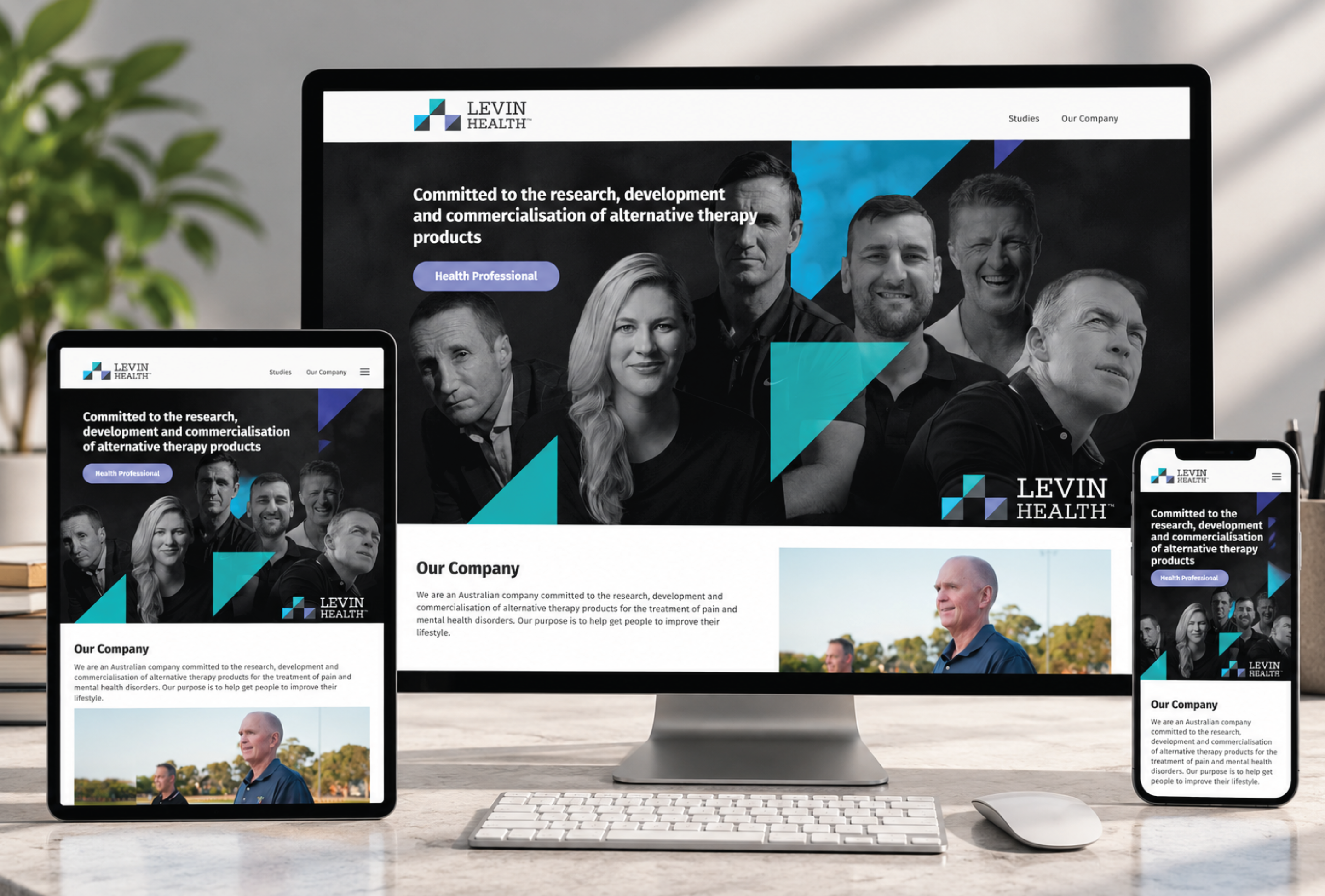
A distinctive brand identity built from the core elements of the Levin Health logo. Geometric forms and a confident colour palette were developed into a flexible visual language, creating consistency across every brand touchpoint.
The logo’s geometric forms become a bold, repeatable graphic device. Cyan and violet accents add recognition and movement across a clear black-and-white foundation.
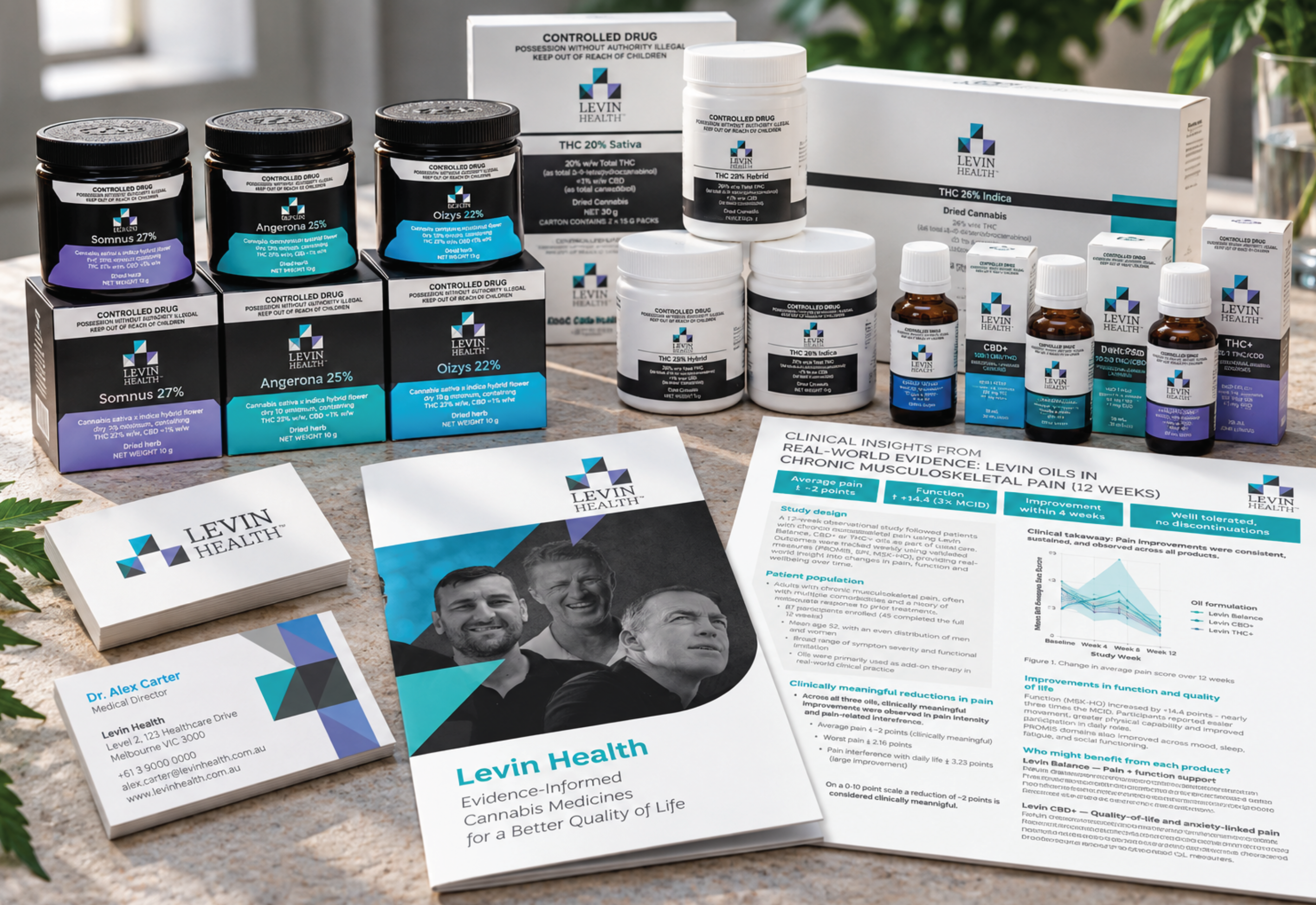
The core geometric forms and colour palette of the Levin Health logo provide the foundation for a distinctive visual identity. Repeating and extending these elements creates a flexible language with a recognisable character.
The identity was rolled out across packaging, print and digital, giving the brand a consistent presence wherever people encounter it.
Corporate collateral, clinical communications and product materials use the same graphic system, supporting clear, cohesive communication across different audiences and formats.
A joined-up visual language makes Levin Health more consistent across channels, linking the website, product range and supporting materials within one confident identity.
Project focus Brand identity · Visual system · Packaging · Print · Clinical communications · Website design
This project was completed while working at et al. Health Communications.
Back to projects