Herbanica logo with the Australian-grown botanicals tagline on a natural dried-flower background
The project

A new chapter
for Herbanica.

Herbanica is a sub-brand of PPC Herbs. As the brand expands into Europe, it needed a refreshed identity that could introduce its Australian-grown botanicals to an international audience and build recognition in a new market.

The work brings together a renewed logo, a clear and approachable tone of voice, and a considered packaging colour palette. The system keeps Herbanica’s Australian botanical origins visible while creating a confident, consistent presence across products and communications.

01 / The identity

From exploration
to final mark.

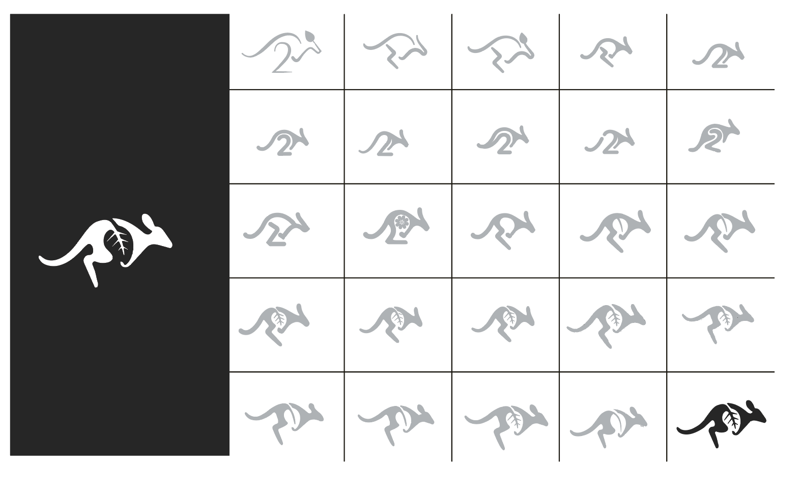
The logo developed through a series of kangaroo concepts, gradually bringing the botanical leaf into the form. The exploration refined the movement, silhouette and leaf detail into a distinctive mark that connects Australian provenance with Herbanica’s botanical range.

Herbanica kangaroo and leaf logo exploration, showing how the botanical detail was developed within the mark
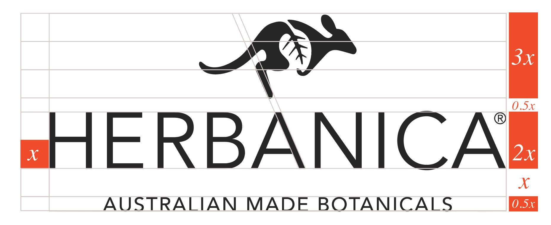
Construction grid showing the proportions and spacing of the Herbanica wordmark and kangaroo symbol
Designed to work as a system

The wordmark and symbol are built to work together at full scale, with a standalone mark for compact placements where the tagline cannot remain legible.

02 / The colour story

Grounded in
the landscape.

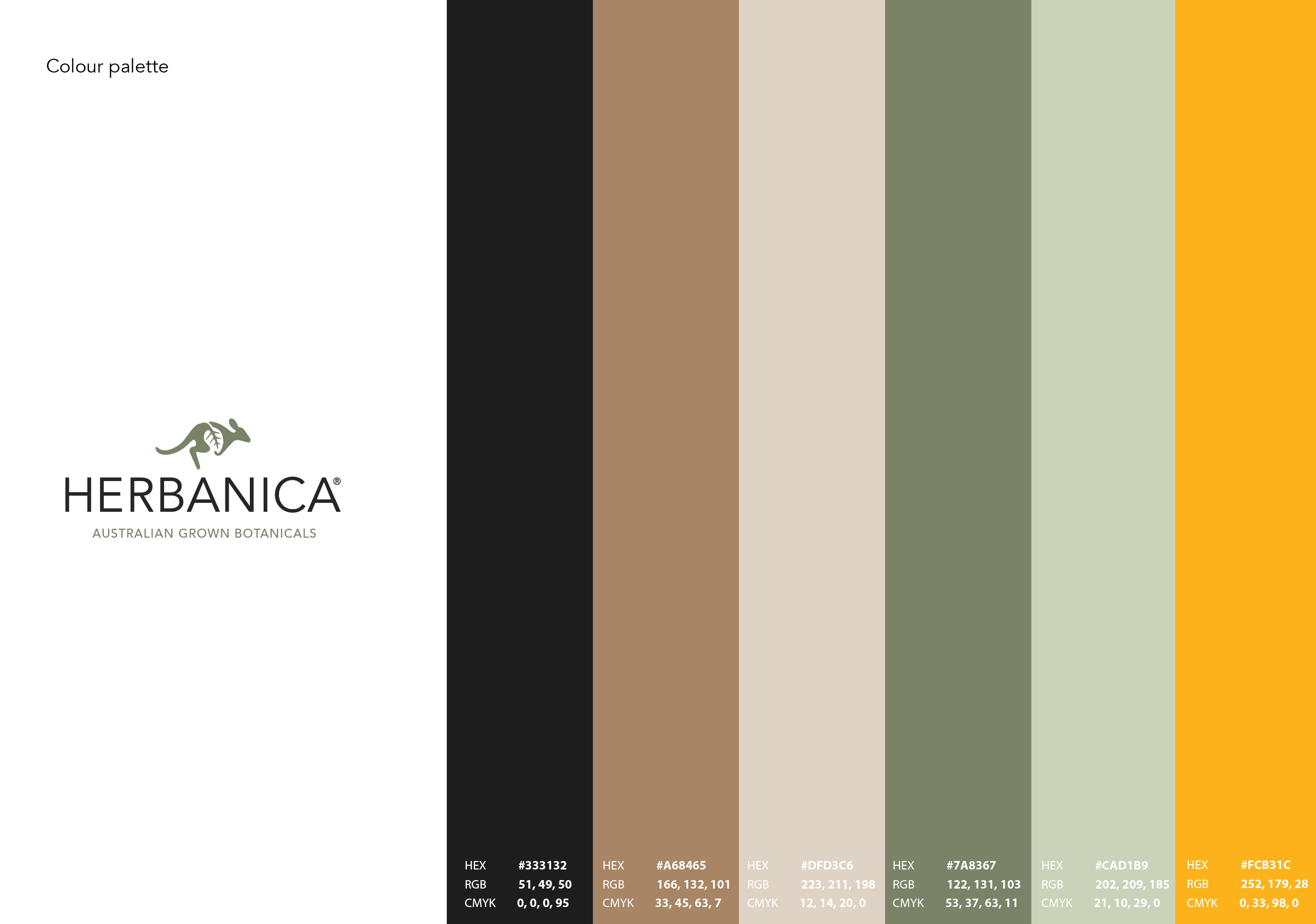
Earthy neutrals and botanical greens create a calm foundation, with a bright golden accent to bring energy and shelf visibility.

Herbanica palette of charcoal, warm brown, soft cream, sage green, pale botanical green and golden yellow
03 / Packaging in use

Clear on shelf.
Part of a family.

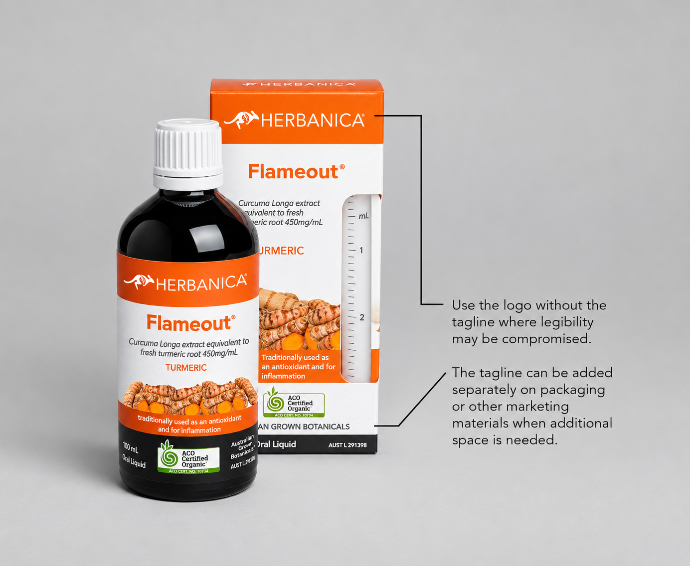
A consistent brand signature anchors the range, while product-specific colours and imagery make each botanical easy to find.

Herbanica Flameout turmeric liquid bottle and carton with the refreshed logo and orange product colour
Herbanica herbal remedies campaign showing the refreshed identity, Australian grower, product range and brand claims
Case study · Brand refresh

Rooted in nature.
Ready for the shelf.

01 / The brief

Prepare for a new market

As a PPC Herbs sub-brand expanding into Europe, Herbanica needed to speak to a new international audience. The refresh was designed to strengthen recognition and bring greater clarity and consistency to the brand across markets.

02 / The identity

Make the mark meaningful

A kangaroo carries the Australian connection, while a leaf detail signals the botanical focus. The clean wordmark and flexible logo lockups help the identity adapt to different formats and available space.

03 / The system

Give every product a place

Charcoal, warm earth and soft creams are balanced with sage, leafy green and a bright golden accent. On pack, the shared brand signature ties the range together and distinct product colours support quick recognition.

04 / The voice

Speak across borders

The tone of voice keeps the brand clear, approachable and grounded in its Australian botanical origins. It gives Herbanica a consistent way to introduce the range to European customers while letting product information lead.

Project focus Brand refresh · Logo design · Tone of voice · Packaging colour palette · Brand application

This project was completed while working at et al. Health Communications.

Back to projects