Keep the familiar
The breathing motif and distinctive blue remain the anchors of the identity.
 View next project
Healthcare · Brand refresh · Packaging
A familiar name with a clearer, more confident presence. A thoughtful refresh built around the brand people already know.
Explore the project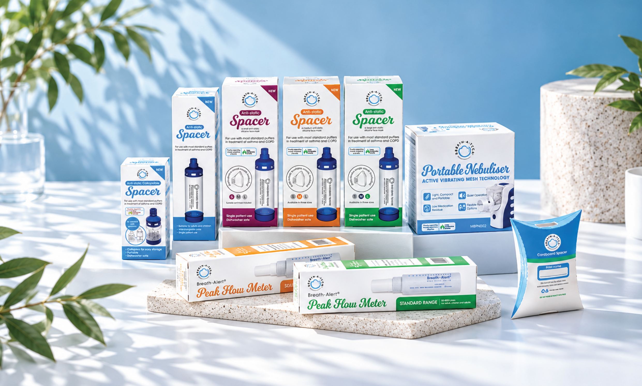
For more than 30 years, Breath-A-Tech has supported Australian pharmacies, medical clinics and people managing asthma and COPD. The brand already had recognition and trust behind it, so the brief was not to start over.
This was an evolution of the existing brand and logo: a refresh that keeps the familiar breathing symbol and core blue, grey and charcoal palette, while refining the mark into a cleaner, more cohesive identity. The goal was to make Breath-A-Tech feel current and consistent without losing the equity built over time.
Keep what people recognise. Improve how the brand works.

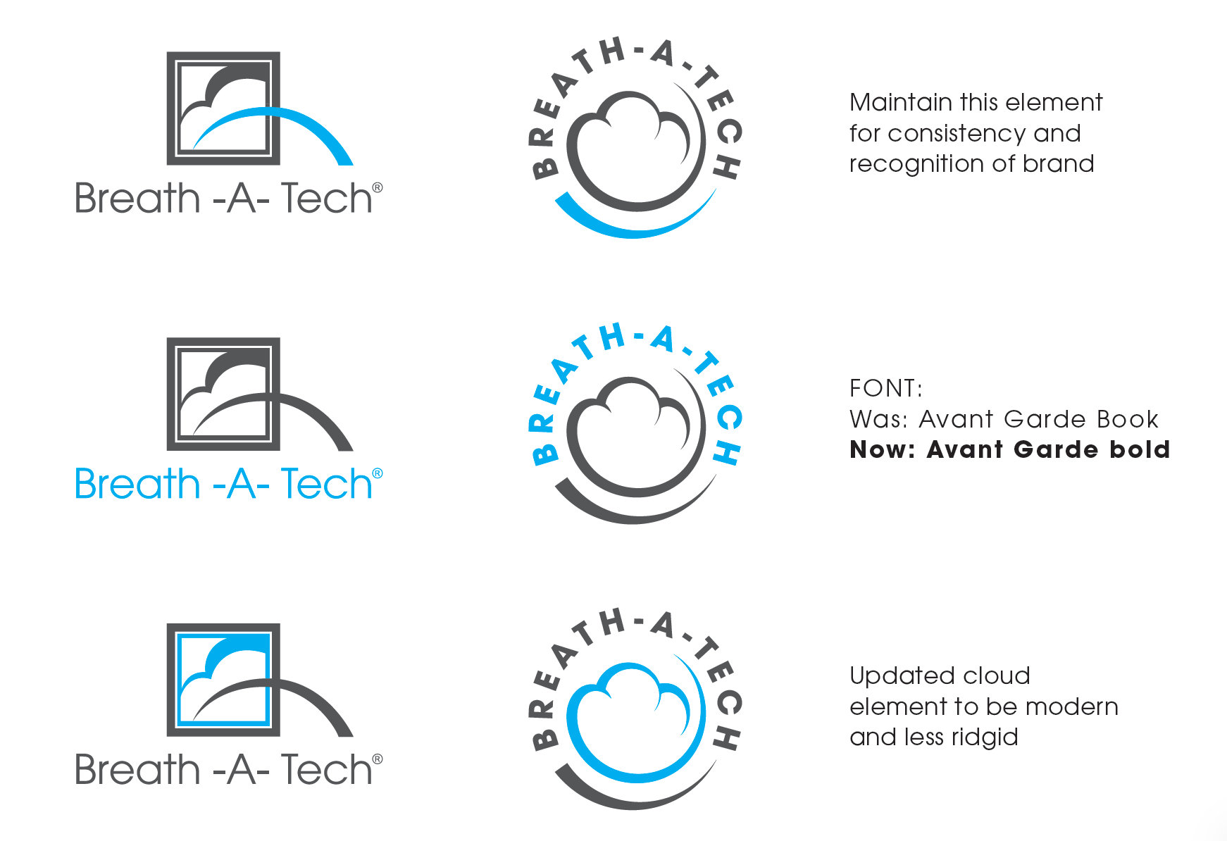
The breathing motif and distinctive blue remain the anchors of the identity.
A cleaner circular lockup improves legibility and brings the name and symbol together.
The refreshed identity gives a growing range of respiratory products a consistent face on shelf.
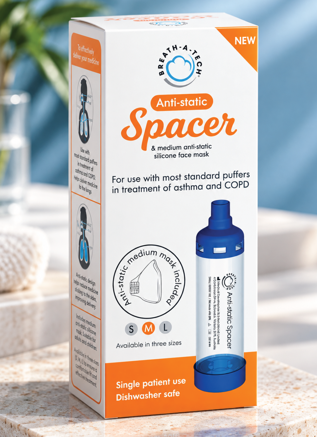
The updated logo sits naturally across spacers, peak flow meters and other respiratory devices. A structured packaging system helps each product stand out while keeping the family recognisably Breath-A-Tech.
Breath-A-Tech has supported Australians living with asthma and COPD for more than 30 years. The opportunity was to refresh the brand for its next chapter while protecting the familiarity and trust already built with patients, pharmacies and clinics.
The existing identity was recognised, but needed a clearer and more consistent expression across an expanding respiratory care range. A complete redesign would have discarded valuable brand recognition.
The established breathing symbol and blue, grey and charcoal palette informed a refined circular logo. The update improves clarity and cohesion while retaining the core cues people already associate with Breath-A-Tech.
The refreshed identity carries across spacer and respiratory product packaging, bringing a more consistent shelf presence to the range while keeping individual products easy to distinguish.
Project focus Brand refresh · Logo refinement · Packaging design
This project was completed while working at et al. Health Communications.